Escape the Beige: Bring Energy and Personality Back into Your Home
Over the past decade, neutral tones—particularly beige, greige, and taupe—have dominated home interiors across the world. Pinterest boards, real estate listings, and Instagram feeds have celebrated their calm, clean aesthetic. And while there’s no denying the elegance of a minimalist palette, an over-reliance on beige can begin to feel dull, impersonal, and uninspired.
If your home looks polished but leaves you feeling uninspired, you might live in the Beige Trap. It’s subtle but real—the way a space designed to be “safe” ends up sapping your creativity and energy. This article is your invitation to break free. With easy tips and practical design swaps, we’ll show you how to bring personality, depth, and life back into your home—without sacrificing sophistication.

Why We Fell for Beige (and Why It’s Wearing Thin)
Beige’s rise to popularity wasn’t an accident. It was practical. Neutral interiors became synonymous with clean design, high resale value, and timeless elegance. From West Elm to Pottery Barn, beige and greige filled showrooms because they’re easy to sell and hard to get wrong. They go with everything—or at least, they’re supposed to.
Minimalist trends like Scandinavian and Japandi (a blend of Japanese minimalism and Scandinavian comfort) design further elevated the all-neutral look. Soft beige walls, light oak floors, stone countertops, and linen upholstery promised a calm, clutter-free lifestyle. The problem? In trying to please everyone, beige often pleases no one.
Over time, these subdued spaces can feel lifeless and emotionally flat. Without contrast or personality, your home stops feeling like you. Worse still, the lack of sensory stimulation may subtly affect your mood, creativity, and even productivity—especially if you work from home.

Signs Your Home Might Be Too Beige
Not sure if you’ve gone too far with the neutrals? Here are a few telltale signs your space is begging for a refresh:
- You feel uninspired at home. You might love your space in theory, but find yourself craving a change—or scrolling through colorful home tours on Instagram for ideas.
- Everything blends together. When walls, furniture, curtains, and accessories are all similar in tone, there’s no focal point, no rhythm, and no visual excitement.
- Your home lacks memorable features. If guests struggle to describe your living room beyond “cozy” or “nice,” it might be time to introduce elements that reflect your style.
- Photos look flat or washed out. If even natural light can’t liven up your rooms, the problem might be a lack of contrast or variety in color and materials.
- Mood shifts in a negative way. Beige-heavy environments, while calming at first, can eventually feel uninspiring or even a little gloomy—especially during long winter months or in low-light homes.
Feeling called out? Don’t worry—you don’t need to repaint your entire house or throw out the furniture. Sometimes, a few well-placed pops of color or textural shifts can make all the difference.

The Case for Color: Emotional Benefits of a Livelier Palette
Color isn’t just decorative—it’s emotional. Numerous studies in color psychology show how different hues can boost mood, creativity, and energy. Vibrant interiors stimulate the senses and help us feel more engaged in our environment, which is especially important if you’re spending long hours at home.
- Warm colors like terracotta, mustard, and coral bring coziness and vitality.
- Cool tones like ocean blue or forest green add calmness and a sense of connection to nature.
- Bold accents like navy, teal, or chartreuse can energize a room without overwhelming it.
Adding color helps create a space that feels more personal, expressive, and dynamic. It also allows you to tell your story visually—through art, textiles, and accessories that reflect your taste and lifestyle. It’s not about creating a “loud” home—it’s about creating one that feels alive.

Where to Start: Small Shifts with Big Impact
Not ready to repaint an entire room? That’s okay. You can breathe new life into your home by adding just a few colorful layers.
Try these simple updates:
- Throw Pillows & Blankets – Swap out beige cushions for bold, textured or patterned options. Try: Target’s Threshold Collection or Society6 for unique designs.
- Artwork & Prints – A gallery wall or even one oversized print can add personality instantly. Try: Minted, Etsy, or Desenio for colorful wall art.
- Accent Rugs – A rug is a great way to ground a space and introduce pattern and contrast. Look at: Ruggable (machine-washable options), RugsUSA.
- Table Lamps or Lampshades – A colorful base or a patterned fabric shade creates an instant focal point. Try: Anthropologie or World Market for playful finds.
- Houseplants – Add vibrancy and movement. Even faux plants work if you’re light-challenged. Visit: The Sill, Bloomscape, or Home Depot.
Small, intentional pops of color can completely reframe how your home feels—without the stress of major renovations. Combine the right small items that complement each other and you have a mash up of brilliance.

Embracing Color Confidently (Without Going Overboard)
Adding color doesn’t mean you have to abandon your love of neutrals. The trick is balance.
Start with the 60-30-10 Rule:
60% base (your neutrals or existing palette)
30% secondary colour (walls, large furniture, rugs)
10% accent (cushions, artwork, vases)
Not sure where to start? Try one of these foolproof palettes:
- Navy + Mustard + Cream – Rich and warm
- Forest Green + Rust + Pale Wood – Earthy and grounded
- Blush Pink + Olive + Black Accents – Soft with an edge
- Turquoise + White + Terracotta – Airy and vibrant
Testing Tips:
- Buy paint samples and swatch them in different lighting.
- Use peel-and-stick wallpaper or decals to try a bold pattern before committing.
- Mix tones and textures to avoid a “matchy-matchy” look.

Texture, Pattern, and Contrast: The Antidotes to Beige Flatness
When a room feels bland but you’re not quite ready for bold color, texture and pattern are your secret weapons. These design elements add visual interest, depth, and tactile warmth—transforming beige from boring to beautifully layered.
Ways to add texture and contrast:
Mix materials like velvet, boucle, rattan, linen, and leather for richness.
Use layered textiles such as chunky knit throws, woven baskets, and patterned cushions.
Try patterned wallpaper or decals on one accent wall to bring dimension.
Introduce visual contrast with darker elements (like black picture frames or deep navy ceramics) to break up beige-on-beige schemes.
Product tips:
- Boucle Ottomans or Accent Chairs – Available at West Elm or Crate & Barrel
- Peel-and-Stick Wallpaper – Try Chasing Paper or Spoonflower
- Textured Throw Pillows – Shop World Market, CB2, or Target’s Hearth & Hand line
These simple touches turn a room from flat to full of character—without needing gallons of paint.

Real Homes, Real Inspiration: Color in Action
Want proof that breaking away from beige works? Designers and homeowners are embracing colour with warmth, wit, and personal flair.
Instagram accounts to follow for inspo:
- @em_henderson (for cozy + colorful layers)
- @dabito (for fearless, vibrant interiors)
- @thejoshuatreehouse (earthy tones done creatively)
- @houseofhipstersblog (great for mixing pattern + vintage)
- @honeyidressedthepug (quirky, pastel, apartment living)
- @the_shoestring_home (diy decor on a budget)

Colour doesn’t mean chaos—it means character. Start small, build confidence, and let your space tell your story.
It’s Time to Escape the Beige
Your home should be more than a catalog of neutral tones. It should feel energizing, expressive, and uniquely you. While beige had its moment (and it still has its place), leaning too hard into the safe zone can leave your space—and your spirit—feeling flat.
But you don’t need a full remodel to bring your home to life. Whether it’s a single mustard throw pillow, a navy accent wall, or a set of patterned tiles, each new element can reawaken your space and reflect who you are.
So here’s your invitation: Swap out something beige this week. Add one new piece that sparks joy or catches your eye. Reclaim your walls, your shelves, your light fixtures—even your lampshades. Your space deserves a little soul.
Because life isn’t beige. And your home shouldn’t be either. We leave you with more inspirations and a summary checklist below.
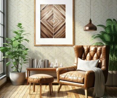
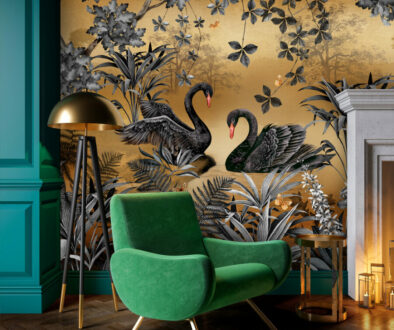
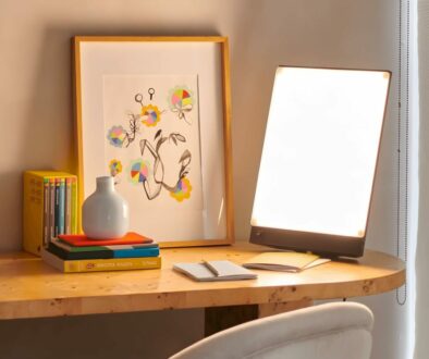
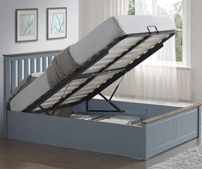
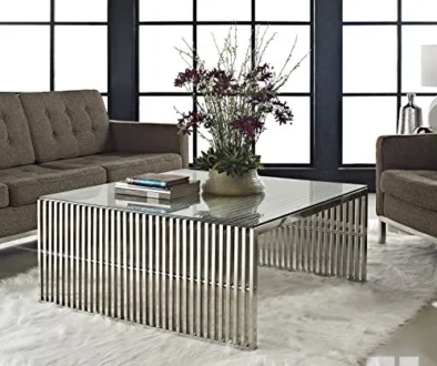
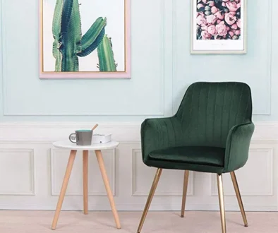
More Inspirations


Click thumbnail above for a closer look.
Summary Checklist – Bring Personality Back Into Your Home

| Action | What to Try | Where to Find / Product Tips |
| Add a Pop of Color | Throw pillows, blankets, vases, lamp bases | Target, Society6, H&M Home |
| Introduce Statement Artwork | Gallery wall, large colorful print | Minted, Etsy, Desenio |
| Upgrade Soft Furnishings | Bold or patterned rugs, curtains | Ruggable, RugsUSA, West Elm |
| Try Accent Furniture | A bold armchair, colorful ottoman | Article, Wayfair, CB2 |
| Add Houseplants | Real or faux greenery to freshen space | The Sill, Bloomscape, IKEA FEJKA range |
| Use the 60-30-10 Color Rule | 60% neutral, 30% secondary color, 10% accent | Apply using walls, furniture, and accessories |
| Layer Textures | Combine velvet, boucle, wood, rattan, linen | West Elm, World Market, Amazon |
| Add Contrast with Dark Accents | Black photo frames, deep-toned ceramics, metal hardware | CB2, Anthropologie, HomeGoods |
| Experiment with Peel-and-Stick Wallpaper | Bold patterns or murals on one wall | Chasing Paper, Spoonflower, Amazon |
| Update Lighting | Colorful lamp bases, interesting shades, warm-toned bulbs | World Market, Lamps Plus, Target |
| Refresh with Pattern | Printed cushions, textiles, backsplash, or floor tiles | Spoonflower, Home Depot, Wayfair |
| Follow Colorful Designers | Inspiration from real homes and fearless design | Instagram: @em_henderson, @dabito, @houseofhipstersblog |
Ready to break free from beige? Start small—add a bold pillow, hang a vibrant print, or layer in rich textures. Reclaim your space with personality, color, and warmth. Your home deserves to feel as alive and expressive as you do.